
This year, Gallery 1313 celebrates its 25th anniversary as a dynamic exhibition space, resource centre, and art hub—by bringing together artworks from over 30 of the gallery’s members, in a diverse and engaging exhibition. Located in the heart of Parkdale, the non-profit gallery occupies a beautiful art-deco style building that was formerly a City of Toronto Police Station. For 25 years, the gallery has held hundreds of exhibits featuring every type of artistic media, and has supported both local and international artists.
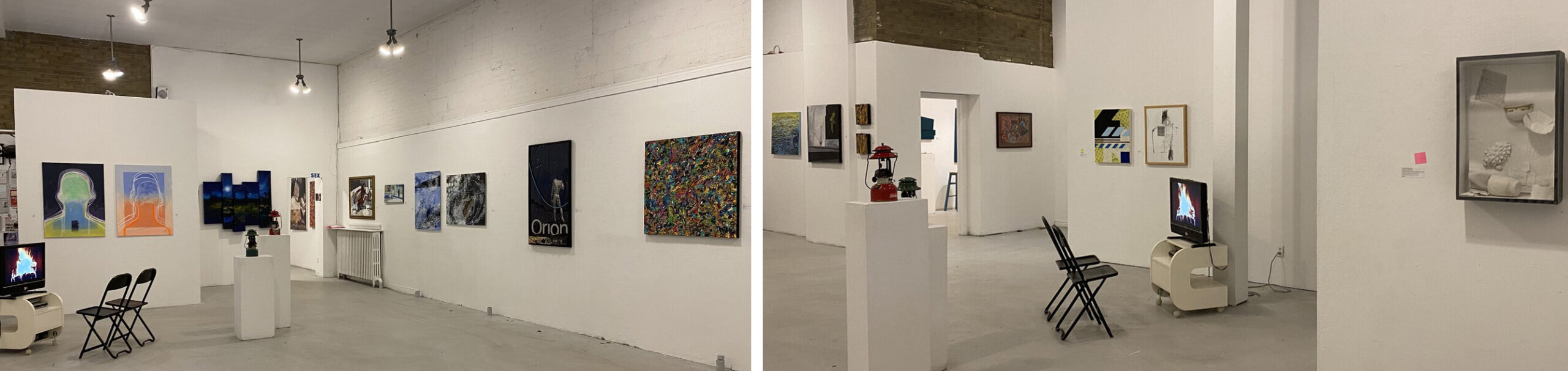
Installation views of Gallery 1313’s 25th Anniversary Exhibit. Courtesy of Gallery 1313 (left) and Photo: Jennifer Boothby (right)
Featuring a broad range of artistic styles and mediums, this 25th anniversary exhibit is truly a celebration of the art community Gallery 1313 has fostered over the years. From abstract paintings with vibrant explosions of colour, to subdued and thought-provoking photographs, to nostalgic shadow-box sculptures—the exhibit is a treat for the eyes and the mind. The show contains 28 works displayed in the gallery and online, as well as 33 additional works displayed online only.
Even with the huge amount of variety among the works in the exhibit, I noticed some common themes emerge. I found that several of the works balance imagery of nature, with dream-like elements.
For example, Toronto-based artist Chris Siems’ paintings Poplars and Borealis, feature groupings of dense tree trunks against vibrant otherworldly skies. These small acrylic and resin paintings portray the interplay between colour and emotion that characterizes much of Siems’ work, and makes them so captivating. Poplars, features five tree trunks rendered in rough brushstrokes of deep blues, purples, browns, and greens—against a bright teal sky. Likewise, Borealis features tree trunks rendered in slightly warmer brown and orange tones, against a rich purple sky. In both paintings, the rough texture of the tree trunks, grounds the trees in reality, while the smooth backgrounds evoke the surreal.
While contemplating the paintings, I found a sense of peace and serenity wash over me, as I imagined standing alone among the trees at twilight, listening to the sounds of the forest, and looking upwards to glimpse the sky through the dense trunks. The cool tones of the teal and purple skies might prompt viewers to imagine a breeze gently whistling through the trees.
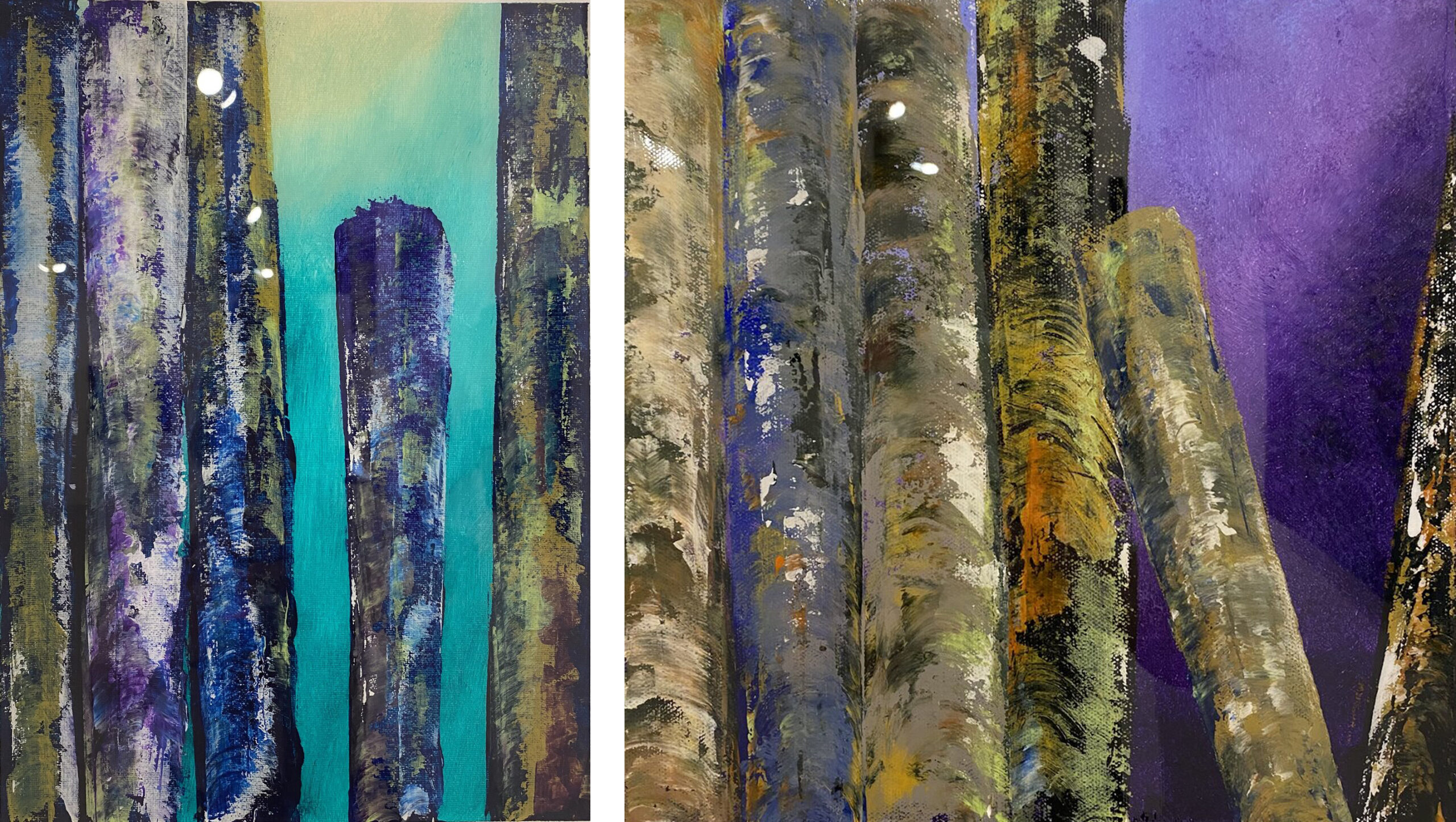
Chris Siems, Poplars, 2021, acrylic & resin on canvas, 12” x 16” (left) & Borealis, 2021, acrylic & resin on canvas, 12” x 12”. Photo: Jennifer Boothby
Similarly, in Dancing Water No. 2, Joan Haberman has created a dream-like waterscape, using vibrant colours and playful brushstrokes. From afar, the yellows at the top of the painting evoke sun reflecting off the waves on a clear day, while the dark blues near the bottom recall shadows closer to the viewer standing on shore. As viewers move closer to the painting, however, a much more varied colour palette emerges. Haberman has woven an intricate pattern of reds, pinks, and browns through the water—creating a sense of depth, and making the waves appear to dance across the canvas.
Haberman has also used repetitive undulating lines to create a dynamic sense of movement. While looking at the painting, I found my eyes moving with the water, following the rhythmic lines horizontally across the piece. At the bottom of the painting, subtle disruptions in the rhythm imply the movement of sea life below the water. Irregular brushstrokes and swirls suggest that viewers are catching glimpses of fish among the waves.
The longer I examined this waterscape, the more I felt a sense of freedom emanating from the dream-like colour palette and undulating movement. The waves extend past the top and sides of the canvas, suggesting a boundless sea stretched out before the viewers.
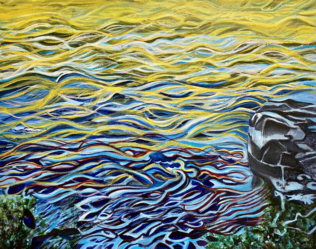
Joan Haberman, Dancing Water No. 2. Photo: Jennifer Boothby
In the centre of the gallery, elevated on two white podiums, Julie Vetro’s eye-catching sculptural pieces, Northwest and Arctic, alsobalance nature imagery with dream-like elements. The lanterns are pieces from Vetro’s six-part series, Vintage Coleman Lanterns. They were inspired by drummer Harry Vetro’s travels to the six Indigenous cultural areas of Canada in 2017—during Canada’s 150th anniversary of Confederation. Through his travels Harry made an effort to connect with musicians and artists from across Canada. Each of the six lanterns in the series seems to document a piece of Harry’s journey through a particular Indigenous cultural area.
These lantern-sculptures prompt viewers to lean in and examine the incredibly detailed worlds Vetro has created. Examining the deep green lantern, Northwest Coast up close, viewers can’t help but extrapolate the miniature scene of trees and rocks, into an entire forest. The vertical metal pieces of the lantern stand in for tree trunks, while the top of the lantern makes the scene seem dark and closed-in, as though the hiker is traversing a dense forest. In contrast the miniature in the red lantern, Arctic, is much more open. The hiker figurine stands proudly atop a rock, as though he has just reached the peak of a mountain.
Contemplating these two pieces—and the ways in which Vetro has blended the natural with the artificial—made me consider the relationship between commercialization and nature. The lanterns themselves evoke the natural, through the rust, dirt, and peeling paint evident on the
bases. However, the sculptures also contain distinctly artificial elements such as the miniature plastic hiker figurines and the Coleman logos still visible on the lanterns.
Further, the sculptures evoke a certain nostalgia. The lanterns are well-worn relics of the past, and could evoke childhood camping trips, while the miniatures and figurines recall childhood play sets.
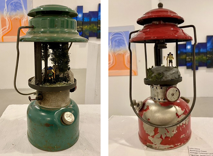
Julie Vetro, Northwest Coast (left) & Arctic (right) both 2018, Vintage Coleman Lantern, miniature hiker figurine, landscape materials, 5” x 5” x 12”. Photo: Jennifer Boothby
Another sculptural piece that evokes nostalgia is the wall-mounted Family Gatherings, by mixed-media and ceramics artist Carolyn Bloomer. In her artistic practice, Bloomer creates both functional tableware and sculptural pieces that incorporate found objects. This unique combination of ceramics and found objects is evident in the array of items strewn across Family Gatherings, which include a tumbler, autumn leaves, a cupcake paper, some handwritten notes, and a dainty teacup.
Surrounded by a deep grey frame and covered with a sheet of acrylic like a shadow box, the piece conveys a sense of stillness and preservation. The objects contained in the frame appear to be relics of the past; objects one might find at a grandmother’s house. They are also appear to be frozen in a state between decay and preservation. The autumn leaves are half-withered, the notes half-smudged, and the tumbler crumbling.
Alongside themes of nostalgia and preservation, the sculpture evokes the surreal. Each object has been slightly distorted, leaving viewers with a sense that something is not quite right. The tumbler at the bottom of the frame lies on its side, decaying. The handwritten notes appear to have been shrunken. The teacup’s interior is lined with 24 carat gold leaf and is embedded in the background. Even the paper lining the background of the frame is slightly crumpled. Additionally, most of the objects have been made of white porcelain, which enhances the sense of preservation, but also makes the entire arrangement seem unnatural.
While reflecting on Family Gatherings, I found this tension between nostalgia and distortion deeply thought-provoking and unsettling. Through a skillful arrangement of elements, Bloomer’s composition encourages viewers to reflect on the past and the nature of nostalgia, and question why we preserve certain elements of the past.
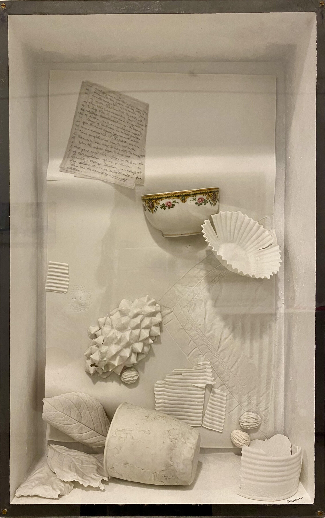
Carolyn Bloomer, Family Gatherings, porcelain, bone china, gold leaf, paint, acrylic; painted wood frame., H 47.5 cm x W 30 cm x D 12 cm. Photo: Jennifer Boothby
As I walked around the exhibit, I noticed that several of the works expressed themes of isolation. Though these works do not specifically reference the global COVID pandemic, they capture the deep sense of loneliness that has characterized the last few years for many people.
I was particularly struck by the solitude emanating from two paintings displayed side-by-side in the gallery: Jacqueline Treloar’s TTC Shelter, and Ruth Hartman’s Beijing Blue. Together these paintings capture the universality of solitude, portraying similarly faceless figures located on opposite sides of the world.
Treloar’s TTC Shelter portrays a familiar image of a person lying alone on a subway bench, debris strewn at his feet. The figure is bundled up in winter clothing, but appears disheveled, with his coat blown open and shoelaces undone. In the everyday hustle and bustle of the subway, a person lying on a bench would not typically draw our eyes, however, Treloar has monumentalized the scene through her use of colour and fabric. The figure’s vibrant red, blue, and gold clothing contrasts his bleak grey and white surroundings, and makes the figure stand out. Additionally, Treloar’s incorporation of fabric creates an interesting clash between the figure’s disheveled appearance and the luxurious fabric patterns that adorn his clothing.
While TTC Shelter prompts viewers to contemplate the social isolation of the figure—a theme that has taken on new significance in the context of the COVID pandemic. Through the figure’s obscured face, the piece invites viewers to transpose themselves onto the figure, sharing in his solitude. In this way, it speaks to our shared experiences of loneliness and isolation over the last few years.
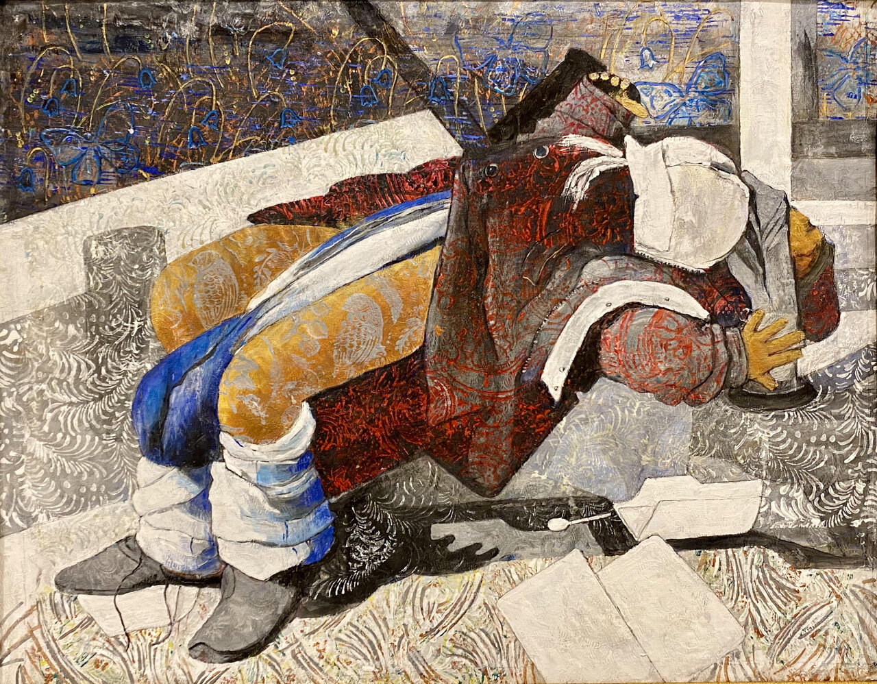
Jacqueline Treloar, TTC Shelter, acrylic on textured fabric, 32 x 39 framed. Photo: Jennifer Boothby
Similarly, Ruth Hartman’s painting Beijing Blue, conveys a sense of isolation through the colour palette and solitary figure. Viewers can again transpose themselves onto the faceless figure, evoking what Hartman refers to as the, “universal within the individual.” Additionally, the predominantly blue colour palette heightens the sense of loneliness.
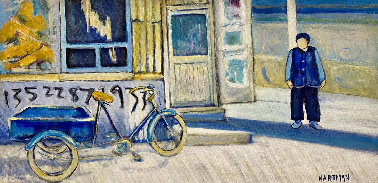
Ruth Hartman, Beijing Blue, acrylic on canvas, 12” x 24″, Photo Courtesy of Gallery 1313
The 25th Anniversary Exhibit at Gallery 1313 captures the diversity of artistic styles among the gallery’s members, and provides visitors an opportunity to experience innovative, often compelling works by local artists. While the exhibit is a chance to celebrate all Gallery 1313 has accomplished in the past 25, the artworks also provide a glimpse into an exciting future for the gallery.
Jennifer Boothby
*Exhibition information: The 25th Anniversary Exhibit, January 19 – February 28, 2022, Gallery 1313, 1313 Queen St West, Toronto. Gallery hours: Wed – Sat 1 – 5 pm. Participating artists include Carolynn Bloomer, Chris Siems, Cindy Y Lam, David Brown, Elizabeth Greisman, Gerda Wekerle, Gert Anckaert, Gwen Tooth, Hugh Alcock, Jacqueline Treloar, Janne Reuss, Jerome McNicholl, Joan Haberman, Joanne Shenfeld, Joanna Black, John Ferri, Jose Cifuentes, Julie Vetro, Leena Raudvee, Marie Finkelstein, Mikael Sandblom, Mirren Hinchley, Pam Patterson, Paul Kilbertus, Ruth Hartman, Sandra Nicole Franke, Sharon Erlichman, Shawn Postoff, Stephanie McLean, Zoraida Anaya, Sonia Langer, among others.
Great article.
Wonderful article, exciting aritists!
Pleas put me on your mailing list.