
Robert Birch has been celebrating thirty years of operating an art gallery this year.
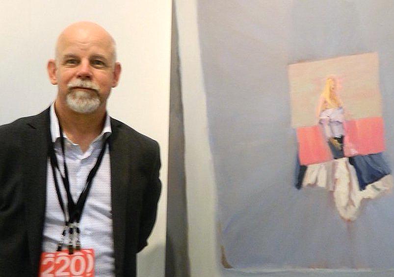
Robert Birch at Art Toronto, 2019. Photo: Phil Anderson
Thirty Years, Thirty Artists, was the theme for his booth at the Art Toronto fair. His September exhibition, 1989 – 2019 featured some of those artists. I asked Robert about the Will Gorlitz painting Bad Faith at the back of the gallery and learned that it was after seeing the work of this artist that he stopped making art. In his estimation, Gorlitz was just too good a painter. Birch had been studying to be a medical illustrator at the University of Toronto, but would hence devote his love of art to its exhibition rather than its making. The Gorlitz painting in the show is enigmatic. A dead-pan self-portrait with the head bandaged had been a recurring theme for the artist at that time. Here he is chest-deep in dark water illuminated by a flaming branch, teeming fish, and a plastic container. I take the figurative elements in Bad Faith to signify a catastrophe of some kind. We can’t know for certain. To me, the loosely wrapped head covering the artist’s right eye point less to a physical wound, than something psychological, and with some detective work the implied drama may reveal itself. The swami-like Gorlitz, reflected into the inky bath as a playing card knave, has given us the clues and it falls to the viewer to ‘unwrap’ a possible scenario.
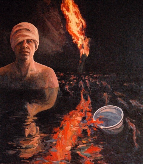
Will Gorlitz, Bad Faith, 1987, oil on board, 86 x 80 in
The Kelly Richardson print, Mariner 9 is eerie. Since it chronicles something literally out of this world, the image is disconcerting and seemingly impossible. Even knowing that Richardson used data provided by NASA to ‘construct’ her image, from data provided by the Mariner 9 space probe, doesn’t make it any less surreal. Her fastidious rendering of the Martian landscape places her on the Red Planet essentially as an eyewitness, allowing the viewer to vicariously share in her experience. The historical precedent to what Richardson has done actually dates back 400 years. Galileo witnessed details of lunar craters that until then were unseen by the naked eye. He pioneered the use of the telescope in his scientific investigations, well before the advent of photography. It meant that Galileo had to transcribe the visual data transmitted by the telescope from retina to paper much like a digital scanner. The ensuing technologies that we now live with are merely added layers between eye and object, the complexity of which having progressively multiplied over the centuries. The rusty wrinkle that Richardson has furnished to the process is a ‘futurization.’ It is an imagined spectacle of what the litter of 200 years of spent probes might look like on a dry and dusty landscape without the benefit of a Martian janitor.
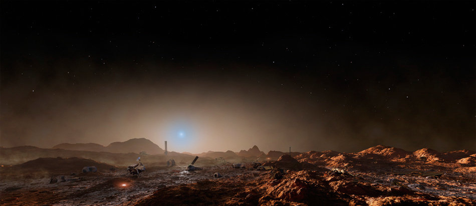
Kelly Richardson, Mariner 9, 2012, C-print, 69 x 30 in, edition of 5.
If I refer to Louise Noguchi’s chrome plated steel pieces as synthetic, I don’t mean that they are fake. If her Broncos and Bucking Bulls works are funny, it’s a molten humour that she has not had to melt from her own cauldron. Noguchi has developed a working method with a broad thematic reach, a leap frog from one disparate subject to another through a process of synthesis. Her chrome plated steel pieces combine the names of rodeo animals that buck, with the logos of the vehicles that their riders might own. Rendered as gleaming chrome word marks, Chunky Monkey, Haywire, and Say La Vee are fun as gallery art, reflecting their aw-shucks western origins, cornball as the oater wit might be. Her Broncos and Bucking Bulls pieces may seem whimsical at first sight, but what is at work here has more kick than meets the eye. When the indigenous peoples of North America first saw a steam-powered train, they called it an iron horse, a synthesis of the known with the unknown. Ownership and identity are entwined in the trade mark. A ranch brand was seared into the cow’s hindquarters by a red-hot branding iron. When horseless carriages started pouring off the assembly line, the metal logos themselves were bolted into the boots and bonnets of each vehicle. In her art, Noguchi has made the cultural and linguistic threads that link these objects visible again.
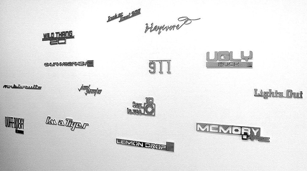
Louise Noguchi, Broncos and Bucking Bulls, 2002, chromed steel, various sizes, edition of 5
Mitch Robertson’s Dying Mouse (in the style of Remington) is an illustration of the persistence and power of myth. In parodying the cowpuncher art of Frederic Remington, he stirs the sleeping ghosts of the Old West, ones that periodically get a dusting off by Hollywood. Robertson’s Dying Mouse was inspired by a myth of the artist’s own making. He had repeated a story of firing suction darts stuck with pins at mice enough times to blur his own memory of it. No longer able to distinguish fact from fiction, he had on his hands a ready-made myth. In Remington’s case, the western artist’s success as an illustrator arrived at the point when the actual Old West was slipping into mythology. His paintings and sculptures were active agents in the transition from reality to romance. Privately, he adopted a “pseudo-cowboy” speaking manner, and allowed his biographers to perpetuate myths of his own Western experiences. The cartoon violence of Robertson’s Dying Mouse collapses some of the brutal realities of our cultural past into his parody. The suction cup dart is a stand-in for work that the arrow, lance, six-shooter, and buffalo rifle had done in the actual west. We live in their residual aftermath.
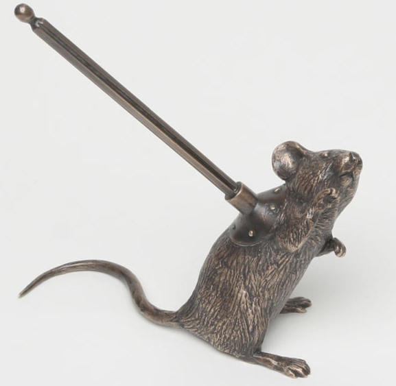
Mitch Robertson Dying Mouse (in the style of Remington), 2013, lost-wax cast bronze, edition of 15
Birch sites Euan Macdonald, now a Los Angeles resident, as the first superstar at his gallery. His loosely painted tree and bandaged hands belie a painstakingly precise conceptual bent. The artist is making a visual analogy in very simple terms. Trees are like people in that they have a trunk and branches as we have torso and arms that branch from hand to finger. The painting has the limbs stretching from one edge of the canvas to the other, the canvas being its medium of transport. We might continue in this vein of inference, but need to know something further. “Why the bandaged hands?” It turns out that they are about a tendon injury that Macdonald sustained at a job. He needed the support that the swaddling provided in order to keep working. The graphic depiction of it in the painting draws on a historical bit of datum. The knights of yore bandaged their hands with leather before donning their gauntlets. With metaphor and analogy at a gallop, we may attribute sensitivity and touch from the tender buds and shoots of trees to our very own fingertips.
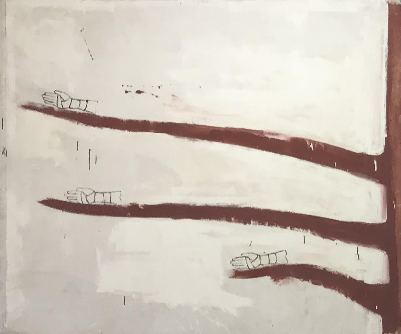
Euan Macdonald, Untitled, 1990, paint on canvas
Peter Smith’s carving of a tree trunk section made a great complement to Euan Macdonald’s tree painting. Having a slight tilt and displayed on a nearby plinth it rounded out the exhibition’s human identification with our pulpy pals. The placement of the bitty log sculpture was curatorial catnip, one work feeding off the other. Its subject, carved in relief around the circumference of the wood was not obvious at first. It depicted, in fact, the arms and hands of transit riders, clinging to straps and bars of the car, ringing the piece of unpainted wood. As a symbol and emblem of dependency, the tree has no botanical equal. It’s a transit system all of its own, ferrying minerals and nutrients from root to branch, thereby feeding, housing, and enriching the biosphere with the necessities of breath and life. Releasing our grip of its tendrils is done at our peril.

Peter Smith, Untitled (Subway series), c. 1994, carved wood, paint and cigarette ash
To enter Birch Contemporary, one necessarily passes under the tip of a Micah Lexier arrow sculpture, the artist who now has a solo exhibition in the gallery. Affixed to the building’s exterior, the work is a functional piece of conceptual art, directing visitors to the correct gallery entrance. A laser-cut steel enlargement of a casually-drawn arrow bears an inscribed affirmation, “This is an arrow…” On the wall behind the desk near the entrance, was another Lexier metal sculpture from his A Minute of My Time series. Like the arrow, its graphic content has been scaled up from note pad doodle-size. These are the kind of unconscious expressions that are generally deemed time-wasters, things done between important things. By transforming doodles into durable art, Lexier has monetized them, reminding us that regardless how we spend it, time is valuable. His coin work floor piece in the corner opposite the desk is to size. It makes use of perspective to give it a sense of scaling down, the negative space created by the coin’s placement forming a pyramid. Renaissance artists referred to the converging lines of perspective as the pyramid of sight. These lines are represented on the coin graphically as well as the coin itself. When photographed, the magnification of the corner of the gallery represented here comes across as crude, highlighting its imperfections. The enlarged arrow and A Minute of My Time works were similarly granular in appearance. As our bitmap world is enlarged, it progressively atomizes into finer particles.
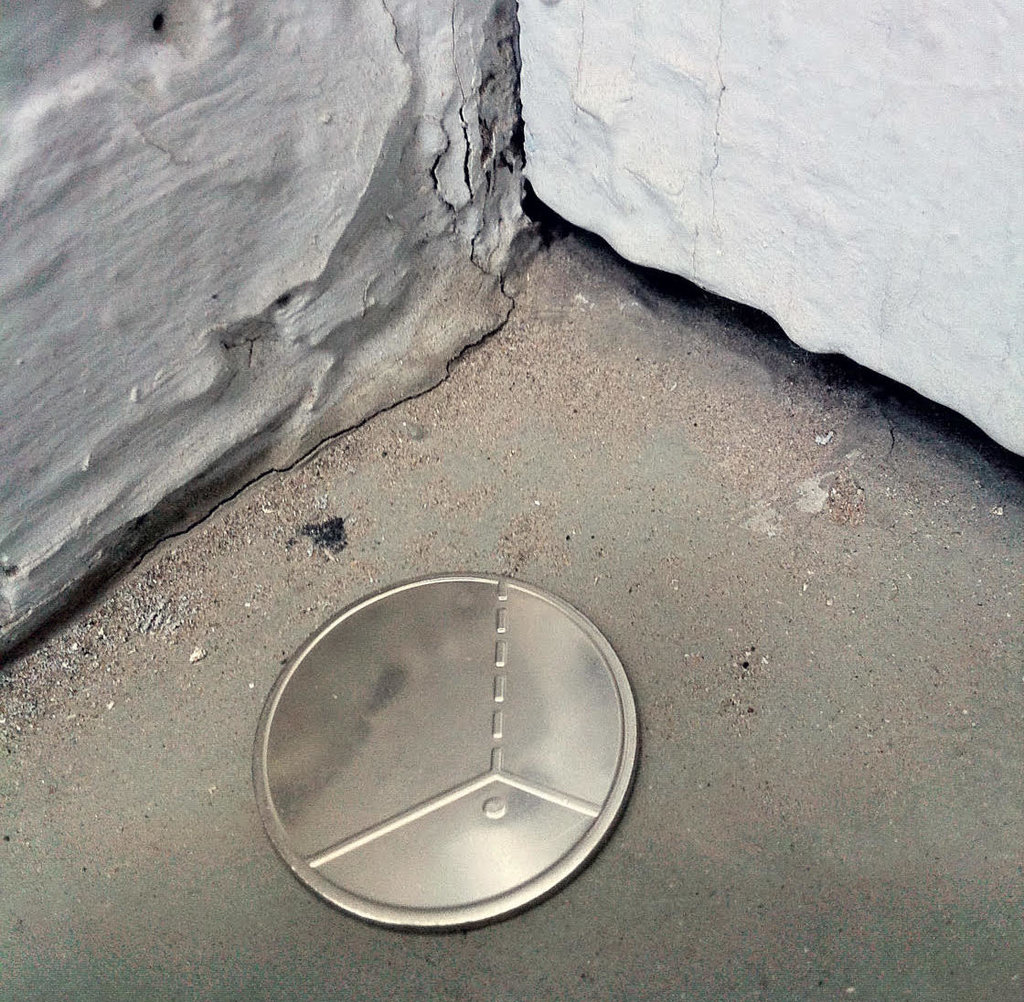
Micah Lexier, Coin in the corner, 2012, Unlimited edition, custom stamped coin, welded rod, 1 1/8” diameter
Showing currently at Birch Contemporary is Micah Lexier’s To Each Corner Its Own Letter. Walking casually into the gallery, it’s easy to miss the exhibition altogether, as I did at first. Our eyes habitually go to walls to find the art, not the corners. The letters that Lexier has installed has in fact magnified the gallery’s emptiness. Once we catch on that the artist has situated the block letters as cues, we are able to ‘read’ the space. We become aware of how floors, walls, ceilings, doors, and stairs fit together in a particular way to create a singular entity. It’s a reversal of our normal perception of figure and ground. The walls as ground has been made hyper-real, the capital letters becoming the phonic soldiers that enforce their emptiness. The A, B, C, Ds wear their metal jackets in primary regimental colours and black. They form a nomadic troupe and may be pegged to any assigned space. It’s a mistake to regard them as merely the magnetized kiddy alphabet aids, which they resemble. Tutoring young Alexander, Aristotle managed to inculcate enough letters into the lad to forge an ambition to empire. By his early twenties, Alexander had hammered his ‘phonic’ digits into battle-hardened phalanxes that conquered the then known world, dragging Hellenic culture with it. Aristotle himself cast a shadow long enough to help in the founding of universities and learning in the West. Its adepts became known as men of letters, or as we would say people of letters. What Lexier has brought to light is an awareness of how conceptualized diagraming is at the heart of, not just building and structure, but of anything that can possibly be made.
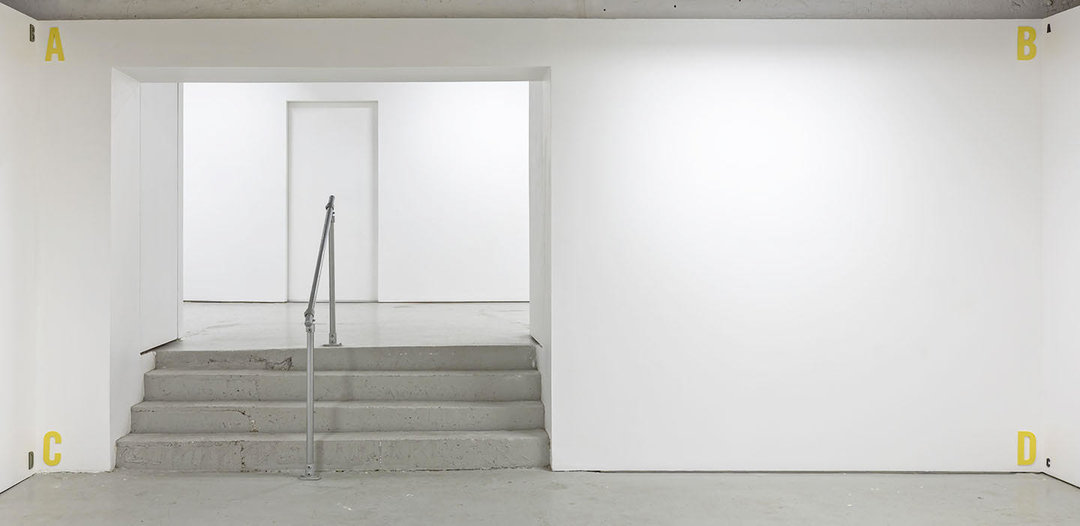
Installation view of Micah Lexier, To each corner its own letter, 2019, waterjet-cut painted aluminum
Steve Rockwell
Images are courtesy of Birch Contemporary
*Exhibition information: Micah Lexier, To each corner its own letter, October 12 – November 9, 2019, Birch Contemporary, 129 Tecumseth Street, Toronto. Gallery hours: Wed–Fri 10 am – 6 pm, Sat 11 am – 5 pm.